Hit enter to search or ESC to close
Close Search
Noct Bureau | Agency of Visual Concepts | Pacific Northwest
search
Menu
  • Case Studies
  • Work
  • About Us
  • Contact
  • search
  • Case Studies
  • Work
  • About Us
  • Contact

WHITE-LABEL


HELLO THERE.

Here are a few new project previews
that you may enjoy.

SCROLL ON


A name hushed amongst friends, a secret hand shake, a glance of acknowledgement, a secret society of like-minded culinary enthusiasts, the Hot Stove Society.

June 28th marks the launch of a new Tom Douglas franchise, a cooking school shrouded in secrecy while developed over the last year in a new downtown Seattle custom kitchen. Noct was tapped to define the aesthetic of this new venue venture by creating a charcoal scrawled logo with a myriad of coal-drawn illustrations as supporting brand elements.


The crew at Tom Douglas Restaurants gave Noct a call to design the branding package for Eric Tanaka’s new restaurant venture. Putting a modern twist on traditional Japanese iconography, we created a logo and icon system that the Douglas crew could implement across the entire restaurant concept.
They also wanted squid involved, lots of squid.


With aligned ethos concerning emerging technology, evolutionary startups, and empowering people, the fit between the Rebls team and our crew at Noct was seamless. As the gears towards launch date began to turn, Noct joined the endeavor to design UI/UX across screen, tablet, and phone environments as well as designing a playful brand identity that stands apart in the real-estate marketplace.

We can’t divulge too many details, but the launch date is right around the corner. Expect big news from these Rebls.


Pulling inspiration from the industrial lines of cold-press juicers and high-end barista equipment, Noct created an identity that is equal parts forged-steel and Detroit retro. Shop owner, Tom Douglas, requested a nod to his trophy Elk rack that sit’s in the shop lobby. A geometric bull now keeps safe watch over this new Seattle Coffee & Juice bar.


Clean, colorful, and geometric were the driving forces behind the branding package of this new Belltown market on 6th avenue. From signage and product packaging to displays and growler bottles, we implemented a midcentury swedish inspired brand package that is a glowing addition to the Seattle sky line.


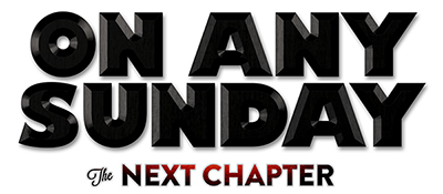
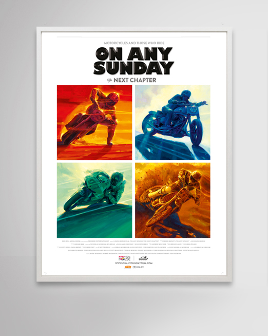
ON ANY SUNDAY: THE NEXT CHAPTER

It’s been four years since we began Art Directing for Red Bull Media House and with each film release, the legacy continues. This year we’ve teamed up with Dana Brown (of Endless Summer fame) and the boys at Freeride Entertainment to brand Red Bull’s newest endeavor, On Any Sunday: The Next Chapter.

Documenting the role that motorcycles play in many of our lives, the film pulls out all stops to show each facet of this broad sport spectrum. With posters and memorabilia destined for shop and garage walls, we called upon veteran motor-head painter Tom Fritz to create portraits of the motorcycle world’s main genres. This art, combined with our branding, packaging, motion work, ad campaign, and website will ensure that this feature length film is as timelessly branded as it’s original incarnation.


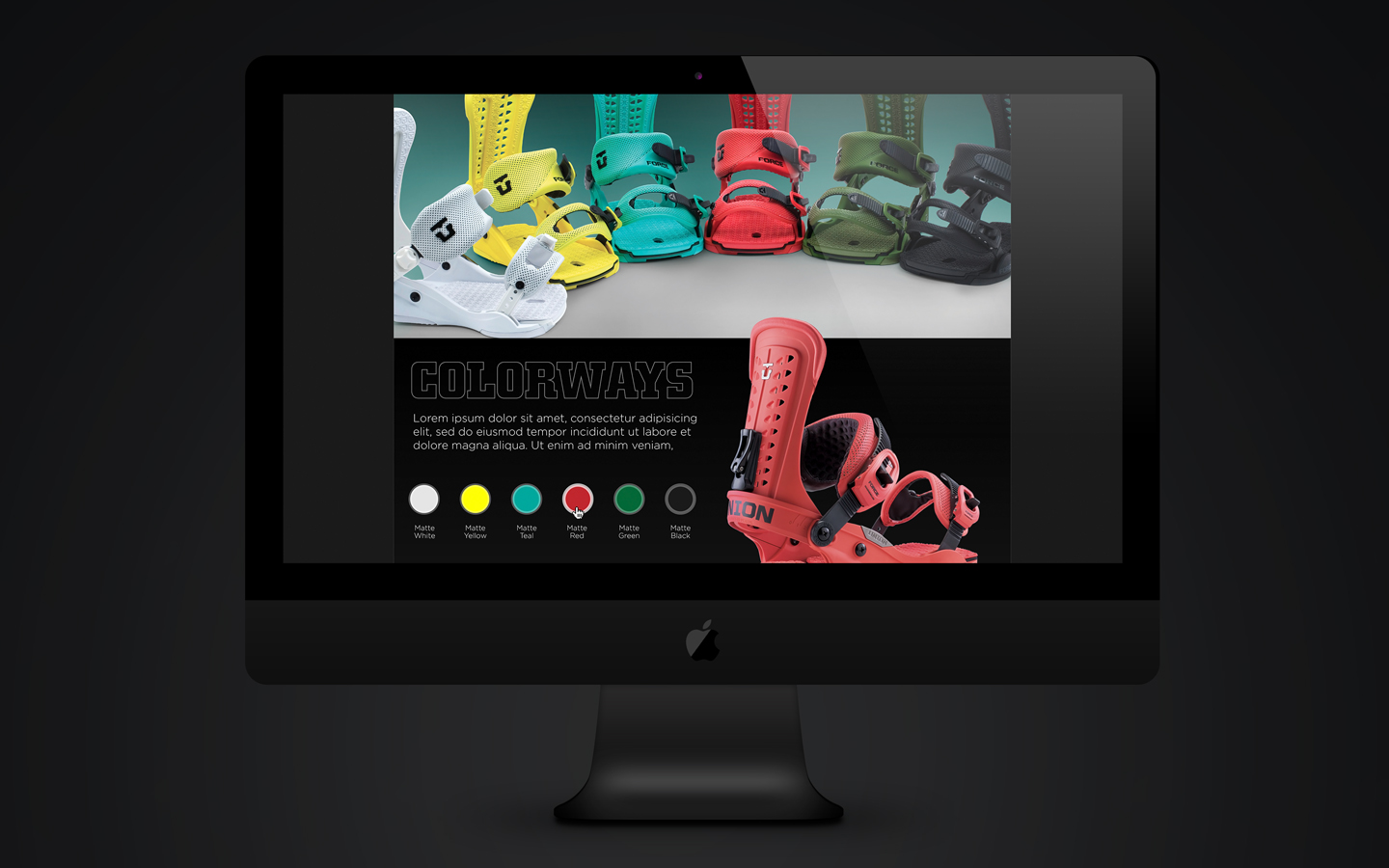
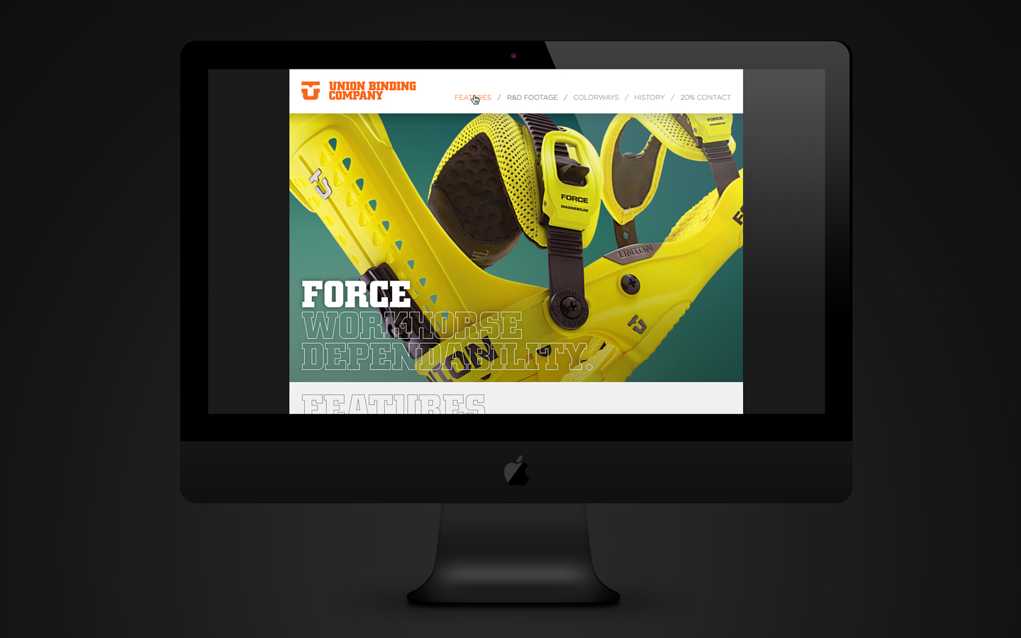
UNION BINDING CO. 2014

2014-15 marks the beginning of our third year as Art Director for the Union Binding Company. Catalogs, softgoods, product design, tradeshow booths, video, ad campaigns, iPad sales apps, and a fully redesigned web presence all add up to create a design package that has carried Union to the top of the snowboard industry.

With eyes on redefining the way engineering and design join hands, we couldn’t be in better company.

Here’s a sneak peak of some new web interfaces we’ve been working on.


GET DEEPER

BACK TO NOCT


LETS GO
 
Share Share Share Pin

© 2025 Noct Bureau | Agency of Visual Concepts | Pacific Northwest.

  • instagram