2016 AD CAMPAIGN
Client: UNION BINDING COMPANY
Date Completed: 2015 – 2016
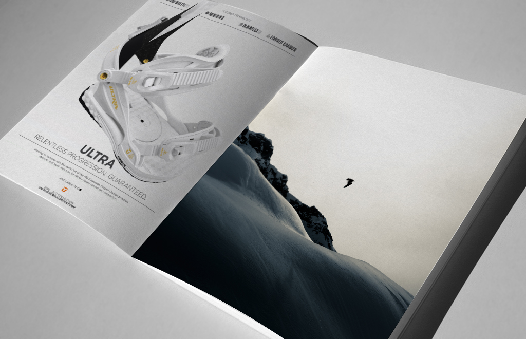
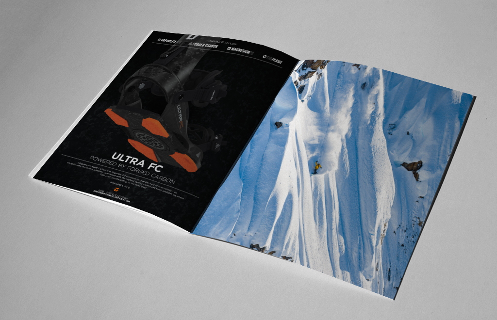
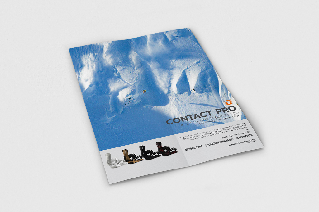
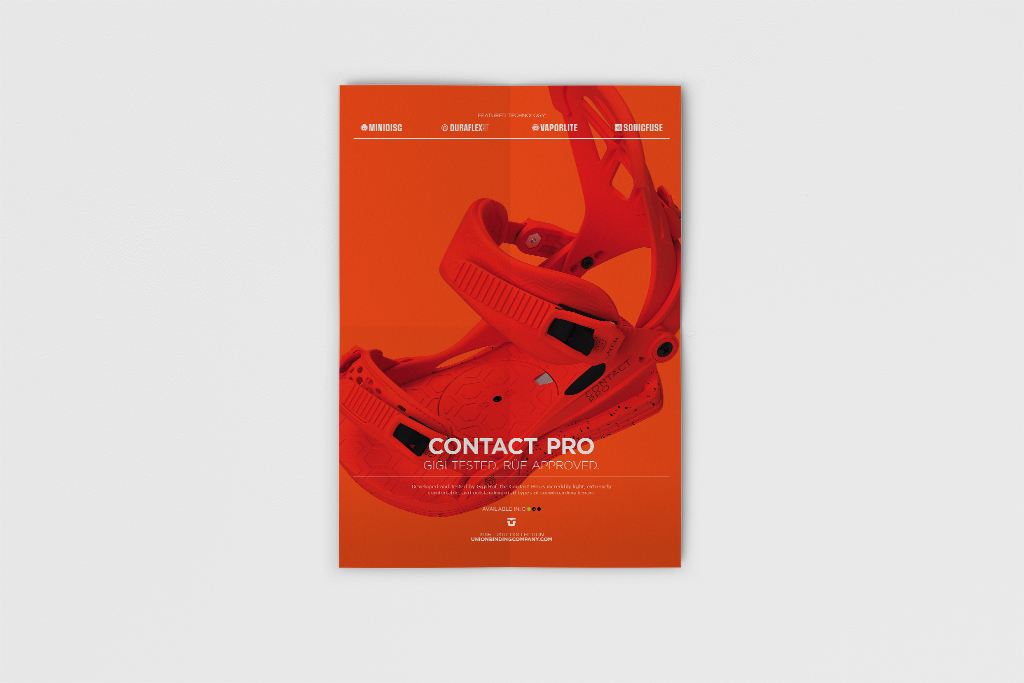
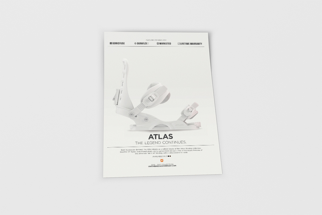
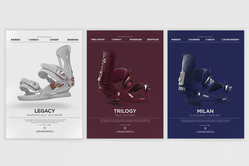
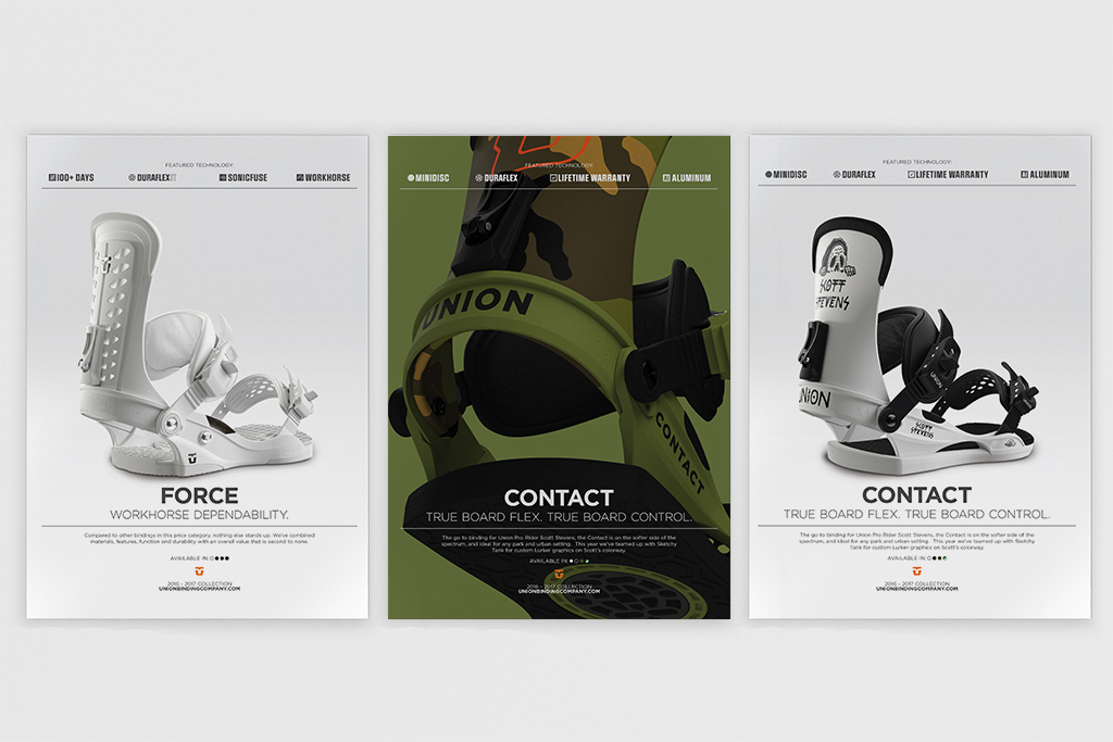
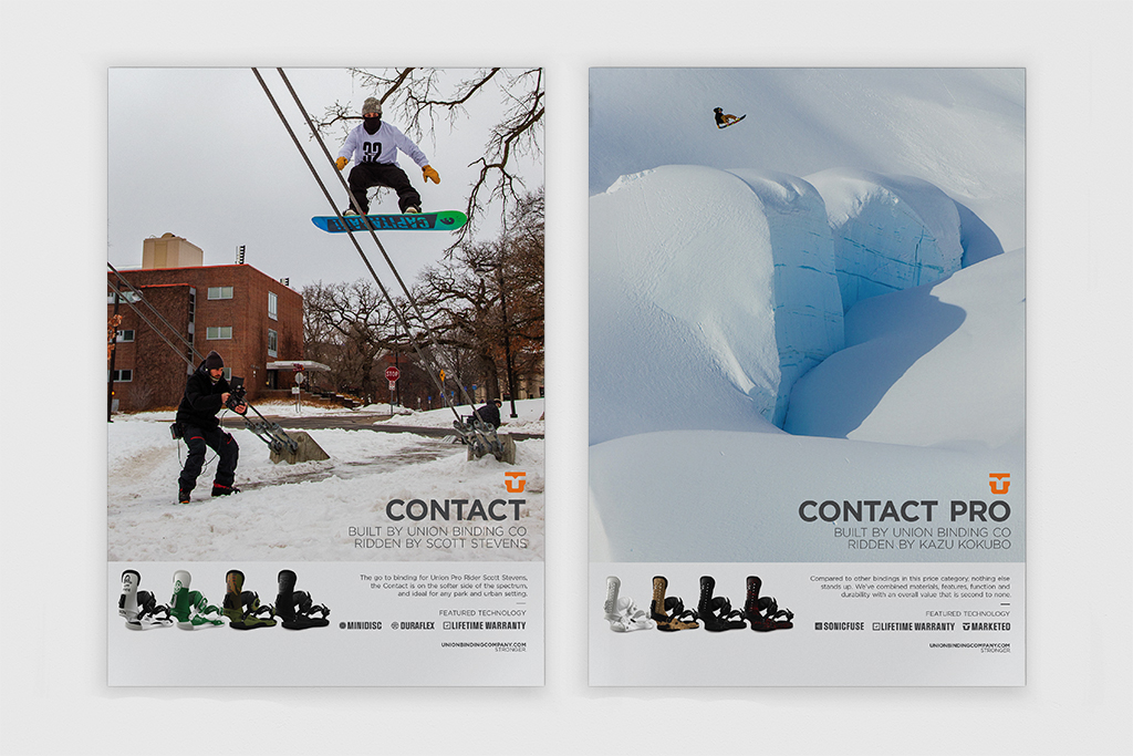
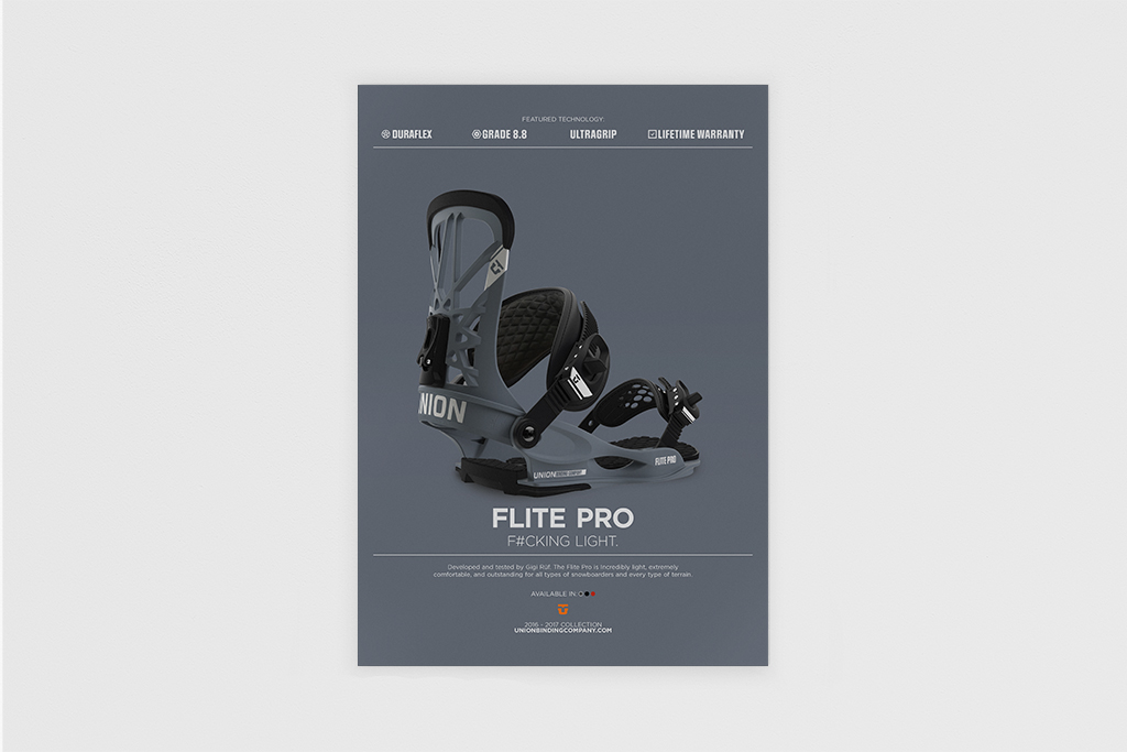
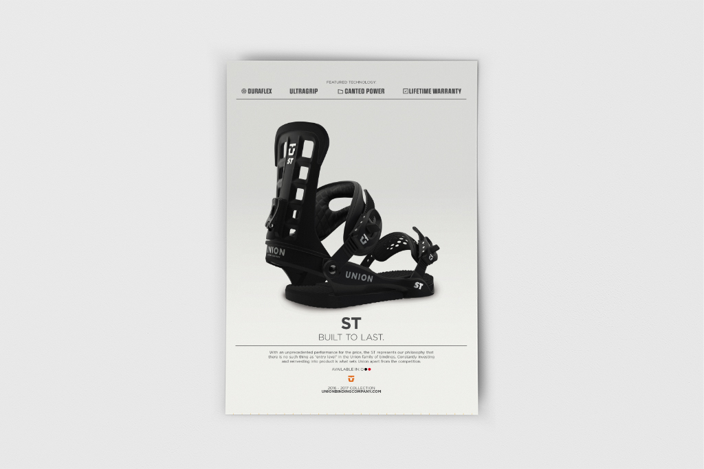
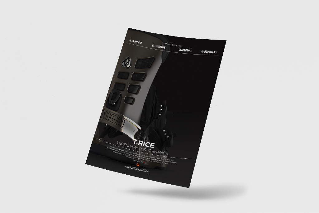
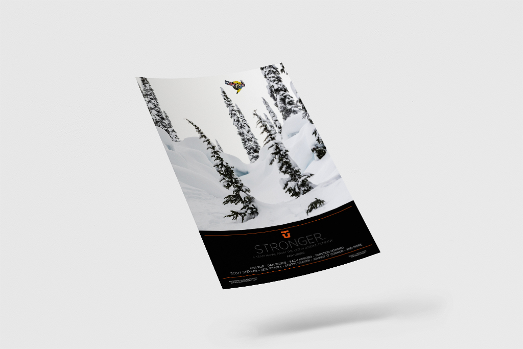
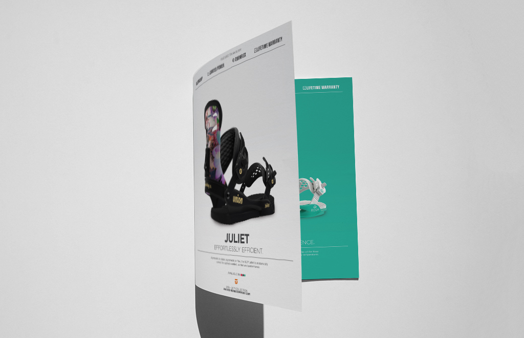
After designing the 2016 Union Catalog alongside yearly aesthetic updates, the next task we turned our attention to was the creation of the upcoming seasons ad campaign. For 2016 we segmented our campaign in two directions, one focused on riding/action, and the other focused upon highlighting the features/personality of the bindings.
Union creates bindings that are the pinnacle of performance to support a team of riders pushing the boundaries of what is possible on a snowboard. To highlight the high-level of product design and riding synonymous with Union, it was crucial to create an unobtrusive aesthetic that let the photography and product speak for itself.